
The design team was tasked with creating an accessible design system for a full redesign of AssureCare's flagship product. Together we created a design system with 30+ components. Below I share a couple of the components that I had a hand in building.
Using atomic design methodology (atoms, molecules & organisms), the design team and I collaborated to create a comprehensive Design System. Additionally, we ensured that everything was well documented for easy hand-off with development teams.
The components shared here are tabs, modals , and page sections. All of these and more are used extensively in AssureCare's flagship product and are accessible recommendations in the redesign efforts.
Before I jump into the more complex components I want to share en example of an atom. The initial building blocks of a new design system are things like color, typography, icons, and surfaces. The team and I were working with color styles that were random, and often inaccessible. Shown below is a mockup of an existing screen that demonstrates a small assortment of primary colors.

Trying not to stray to far from the blue/grey color system already in place. The team and I selected the colors below for primary action.

Tabs are considered a molecule in the atomic design system. Molecules contain a few nested atoms and sometimes nest other molecules. In the example shown here the nested nested components are static tags and icons. These are all boolean variants and can be toggled on/off depending on the design scenario.

Every component documented in the design system outlines the basic anatomy and provides visibility into the different states and nested components that can be used.

Tabs organize and allow navigation between groups of content that are related and at the same level of hierarchy. I have demonstrated how they are used in the Utilization Management project.
Organisms have more complex functionality than the molecules and use more nested components. For this product I needed to design both a center and side modals for different use cases.


The heading of the modal contains boolean variants that can be toggled on/off depending on the design use case. I also included placeholder slots for components like static tags, buttons, and label text. This allows flexibility as I collaborate with stakeholders and learning product use cases.

Modals are one of the most frequently used components in my designs. I have demonstrated how a side modal is used in the Utilization Management project, and a center modal is used in the Analytics Platform.
The design system supports two types of page sections, cards, and accordions. They are both organisms in the atomic design structure. The primary way they differ from each other is the accordion is built with a chevron on the top right to expand and collapse and the card is not.


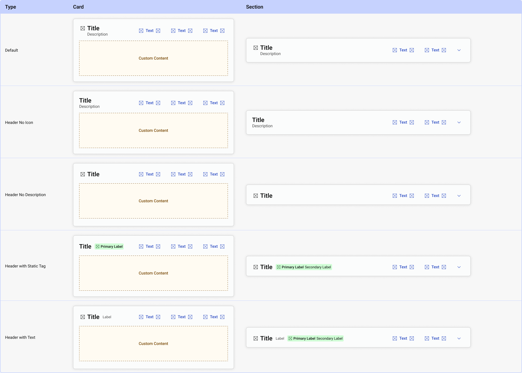
At this point I've used cards and accordions interchangeably. The components are very similar and can be customized to fit most use cases. I have demonstrated how cards are used in the Utilization Management project.
I worked closely with the development team that was tasked with translating these components from Figma into a storybook. At the same time, I continued to use these and other components from the design system in all of our designs.
Through working on this project I learned a lot about building and maintaining a design system. I had the the opportunity to collaborate closely with fellow designers.
Recommendation of my work from design team member:
Lauren's attention to detail and collaborative approach made a significant impact. She quickly demonstrated her proactivity and ability to research and learn about design systems, standing out in the creation of functional and scalable components. Her support with component documentation was a game changer—not only ensuring the development team had everything they needed to implement components efficiently but also advocating for their consistent adoption.
